Read about Andrew Fox’s personal journey in Data Visualisation and Designing Dashboards, with an example of a real dashboard journey.
NTT DATA Business Solutions
My journey in dashboards: From Flashy to Few and back again …

I’m trying to weave two paths in this blog post about dashboards..
- My personal journey in data visualisation (and in particular designing dashboards)
- How this aligns to my experiences in dashboard projects.
What is a journey?

To me a journey is travelling from one point to another with endless possibilities in between. Sometimes it’s easy, other times hard and often muddy along the way.
My dashboard journey started when I built my first one for a customer using what was then called Xcelsius now SAP Dashboards. Like a lot of people who start working in a new technology area I started reading books, blogs and frequented Twitter. I swallowed the academic view of “What is a dashboard?” hook line and sinker and was (and you could say I still am) heavily influenced by the work of Stephen Few and Andy Kirk. I even spent 3 days with Mr Few when he delivered a training course in London where he critiqued one of my dashboard designs in public forum, but that’s another story.
Crossroads

Over the last 5 years I have been involved in a number of dashboard projects and as part of them facilitated design workshops. I would normally kick these design workshops off with a data visualisation best practice session to align (you could say influence) the iterative design process. This often puts me on a crossroads …
Do you follow the world’s view of a dashboard which is often influenced by the popular media, bold and attention grabbing? Or, do you follow the academic view which I would summarise as information rich but visually poor? I have always found this a balancing act full of compromises and yes, I have even designed dashboards with pie charts on them in the past!
My personal journey has taken me from back in 2010 when I commented the following:

At that point in time I truly couldn’t comprehend why a software vendor would add an exploded 3D pie chart to their chart library. Did I miss something at that time? Maybe.
Some years later I posted this.

What changed? I have been on a journey getting muddy boots along the way.
Fast forward to today
In the three years between these Twitter posts there has been significant innovation and advancement in and how we all interact with technology. The world of Twitter, Facebook and iPhone apps have become mainstream.
Has our method of acquiring and consuming information changed as well during that time?
How would you find out the weather forecast for tomorrow?
- Do you ask Siri “Will I need my umbrella tomorrow?”
- Read the morning newspaper
- Watch the TV forecast
- Listen to a radio
- Use an app on your smartphone
Dashboards – What do you do?
For those of you who have heard me speak at the UKI SAP User Group data visualisation SIG or at conferences you may well have heard me suggest the following.“The first dashboard you build and release to users will change over time. Your data visualisation skills will develop and users will, over time, ask for more actionable information in the precious space (real estate) available to them”.I often see this happen not only during the development iterations of a dashboard but it can also be true as users engage with the same dashboard daily, weekly, monthly.
SAP’s Dashboard Journey as demonstrated by their marketing collateral

Circa 2004

Circa 2008

2013
An example of a real Dashboard Journey
A customer, fellow SAP user group SIG chair and friend of mine has allowed me to share elements of the dashboard journey at his organisation, which still isn’t completed as I see drafts of new versions each time we meet to chat over.

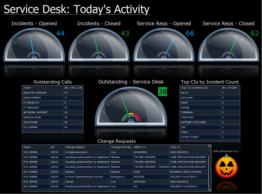

This is a great example of where I have commented above “The first dashboard you build and release to users will change over time. Your data visualisation skills will develop and users will over time ask for more actionable information in the precious space (real estate) available to them”.
Wise words from Andy Kirk
In a presentation by Andy Kirk in London recently he finished up with these wise words…
Strive for Elegance not something cool. What we think is Cool changes over time, Elegance is timeless.
The pictorial example he gave was, don’t be a Fonz from the TV show Happy Days but a Jaguar E-Type
What does your Dashboard Journey look like?

In closing
Let me share two great quotes that resonate to me on this topic:
- Mico Yuk “Make ‘User Adoption’ your ONLY KPI to Measure BI Success”
- Donald MacCormick “To put it more bluntly, employing the mantra “adoption trumps visual efficiency” will see you gain much much more than you lose.”
I agree with the sentiment of both these quotes but I would also suggest that adding best practice data visualisation techniques into dashboards is a worthwhile leg to the journey.
My dashboard journey has now taken me to the point where I agree that you should start with the focus on adoption by making the dashboard “sticky” and encouraging users to return. But I would go on and suggest that after this stage the journey should continue.
Take away
In delivering easy to consume, information rich, actionable insights maximising the use of the real estate available on the consumption device you stand the greatest chance of adoption by the “floating” users.
Finally, a real life example… When building a dashboard for a Proof of Concept I was asked to include the XGlobe from Antivia on a second tab in the dashboard. “Why?” I asked. “It’s cool, the users will love it!”